Fintech
Fintech
Easy Savings
Easy Savings


A 0 → 1 savings platform designed from tangled workshop rooms to a product ready to ship, spanning 4 account types, 12+ products and 3 multi-stakeholder squads
A 0 → 1 savings platform designed from tangled workshop rooms to a product ready to ship, spanning 4 account types, 12+ products and 3 multi-stakeholder squads
A 0 → 1 savings platform designed from tangled workshop rooms to a product ready to ship, spanning 4 account types, 12+ products and 3 multi-stakeholder squads
My role:
My role:
My role:
UX strategy and design direction
UX strategy and design direction
UX strategy and design direction
My engagement:
My engagement:
6
months
6 months
My engagement:
6
months
Build type:
0 → 1 ground up, mobile first
Client:
An Irish retail bank, introducing in UK
Build type:
Build type:
0 → 1 ground up,
mobile
Client:
Client:
An Irish retail bank,
introducing in UK


The setup
The setup
The setup
The brief sounded simple: Let customers discover, open and manage savings accounts.
Then we looked under the hood. There were four account types — Individual, Joint, Minor and Business — each with different eligibility rules, questions and verification requirements.
Three squads were involved: Business & Product, Tech & Compliance and Design. Everyone knew what they wanted. They just didn’t all mean the same thing by “done”. So before designing screens, I started by designing alignment.
The brief sounded simple: Let customers discover, open and manage savings accounts.
Then we looked under the hood. There were four account types — Individual, Joint, Minor and Business — each with different eligibility rules, questions and verification requirements.
Three squads were involved: Business & Product, Tech & Compliance and Design. Everyone knew what they wanted. They just didn’t all mean the same thing by “done”. So before designing screens, I started by designing alignment.
The brief sounded simple: Let customers discover, open and manage savings accounts.
Then we looked under the hood. There were four account types — Individual, Joint, Minor and Business — each with different eligibility rules, questions and verification requirements.
Three squads were involved: Business & Product, Tech & Compliance and Design. Everyone knew what they wanted. They just didn’t all mean the same thing by “done”. So before designing screens, I started by designing alignment.
First, untangle the knots
First, untangle the knots
First, untangle the knots
I went through the bank’s requirements, broke them down into modules and used those to structure a series of workshops.
I went through the bank’s requirements, broke them down into modules and used those to structure a series of workshops.
I went through the bank’s requirements, broke them down into modules and used those to structure a series of workshops.

The first ideation session was deliberately messy. Get everything out. Put everything on the table. Then start making sense of it.
The first ideation session was deliberately messy. Get everything out. Put everything on the table. Then start making sense of it.
The first ideation session was deliberately messy. Get everything out. Put everything on the table. Then start making sense of it.

From there, I shaped the initial sitemap and studied how savings products in the UK approached discovery, onboarding and account management.
From there, I shaped the initial sitemap and studied how savings products in the UK approached discovery, onboarding and account management.

I sat with all the stakeholders to build the flow diagram which depicted what everyone was considering product onboarding.
I sat with all the stakeholders to build the flow diagram which depicted what everyone was considering product onboarding.

The product was becoming clearer. The onboarding wasn’t. So I ran a focused 2-week stakeholder workshop series to work through the conflicting requirements across homepage, content, information architecture and onboarding. The goal was to map out a shared experience everyone could actually build.
The product was becoming clearer. The onboarding wasn’t. So I ran a focused 2-week stakeholder workshop series to work through the conflicting requirements across homepage, content, information architecture and onboarding. The goal was to map out a shared experience everyone could actually build.

The result: We agreed on the skeleton of the onboarding journeys and the key feature flows for Milestone 1 — two weeks ahead of the original plan. And that gave me the foundation I needed to tackle the real UX puzzle.
The result: We agreed on the skeleton of the onboarding journeys and the key feature flows for Milestone 1 — two weeks ahead of the original plan. And that gave me the foundation I needed to tackle the real UX puzzle.

One onboarding - four personalities
One onboarding - four personalities
My first instinct was to collect basic details — email and phone — before asking what kind of account the customer wanted. The business wanted the opposite. They needed compliance checks to happen before customers invested time in the application. So the “Before you begin” screen moved to the front.
My first instinct was to collect basic details — email and phone — before asking what kind of account the customer wanted. The business wanted the opposite. They needed compliance checks to happen before customers invested time in the application. So the “Before you begin” screen moved to the front.
A small change in sequence. A big change in what the journey was optimising for.
A small change in sequence. A big change in what the journey was optimising for.
My first instinct was to collect basic details — email and phone — before asking what kind of account the customer wanted. The business wanted the opposite. They needed compliance checks to happen before customers invested time in the application. So the “Before you begin” screen moved to the front.
A small change in sequence. A big change in what the journey was optimising for.

From there, I created a Standard Primary Onboarding — the north star for the entire product.
Instead of designing four completely separate journeys, I created one common backbone and treated account-specific journeys as “jackets” around it:
• Joint applicant questions
• Minor-specific questions
• Business-specific questions
From there, I created a Standard Primary Onboarding — the north star for the entire product.
Instead of designing four completely separate journeys, I created one common backbone and treated account-specific journeys as “jackets” around it:
• Joint applicant questions
• Minor-specific questions
• Business-specific questions

The difference between the journeys wasn’t a different product. It was the questions we needed to ask the person using it. Conditional logic and templated screens made those differences manageable without multiplying the design effort.
The difference between the journeys wasn’t a different product. It was the questions we needed to ask the person using it. Conditional logic and templated screens made those differences manageable without multiplying the design effort.
Designing for the messy middle
Designing for the messy middle
The happy path is good, but the interesting part to design is what happens when:
Someone drops off.
Someone is a secondary applicant.
Someone is a US taxpayer.
Someone wants to open an account for their kid.
Someone changes their personal details.
So I designed the flows around those moments too.
The happy path is good, but the interesting part to design is what happens when:
Someone drops off.
Someone is a secondary applicant.
Someone is a US taxpayer.
Someone wants to open an account for their kid.
Someone changes their personal details.
So I designed the flows around those moments too.

When two applicants don't move at the same speed
When two applicants don't move at the same speed
For a Joint account, the ideal journey was simple: Two applicants → one application → done.
Reality had other plans.
The primary applicant had to wait for the secondary applicant to complete their part for the application to be submitted. without any information on how far it has be filled in. To reduce the waiting time and the impatience, I tweaked the flow:
Got the “Introduce joint applicant” ahead in the flow, so that in an ideal case scenario - both applicants can finish their application in the same time.
Added a “Remind joint applicant” button in the last screen of the onboarding for the primary applicant for them to be able to send reminders.
Added status updates in application progress screens, for visibility and transperancy.
For a Joint account, the ideal journey was simple: Two applicants → one application → done.
Reality had other plans.
The primary applicant had to wait for the secondary applicant to complete their part for the application to be submitted. without any information on how far it has be filled in. To reduce the waiting time and the impatience, I tweaked the flow:
Got the “Introduce joint applicant” ahead in the flow, so that in an ideal case scenario - both applicants can finish their application in the same time.
Added a “Remind joint applicant” button in the last screen of the onboarding for the primary applicant for them to be able to send reminders.
Added status updates in application progress screens, for visibility and transperancy.

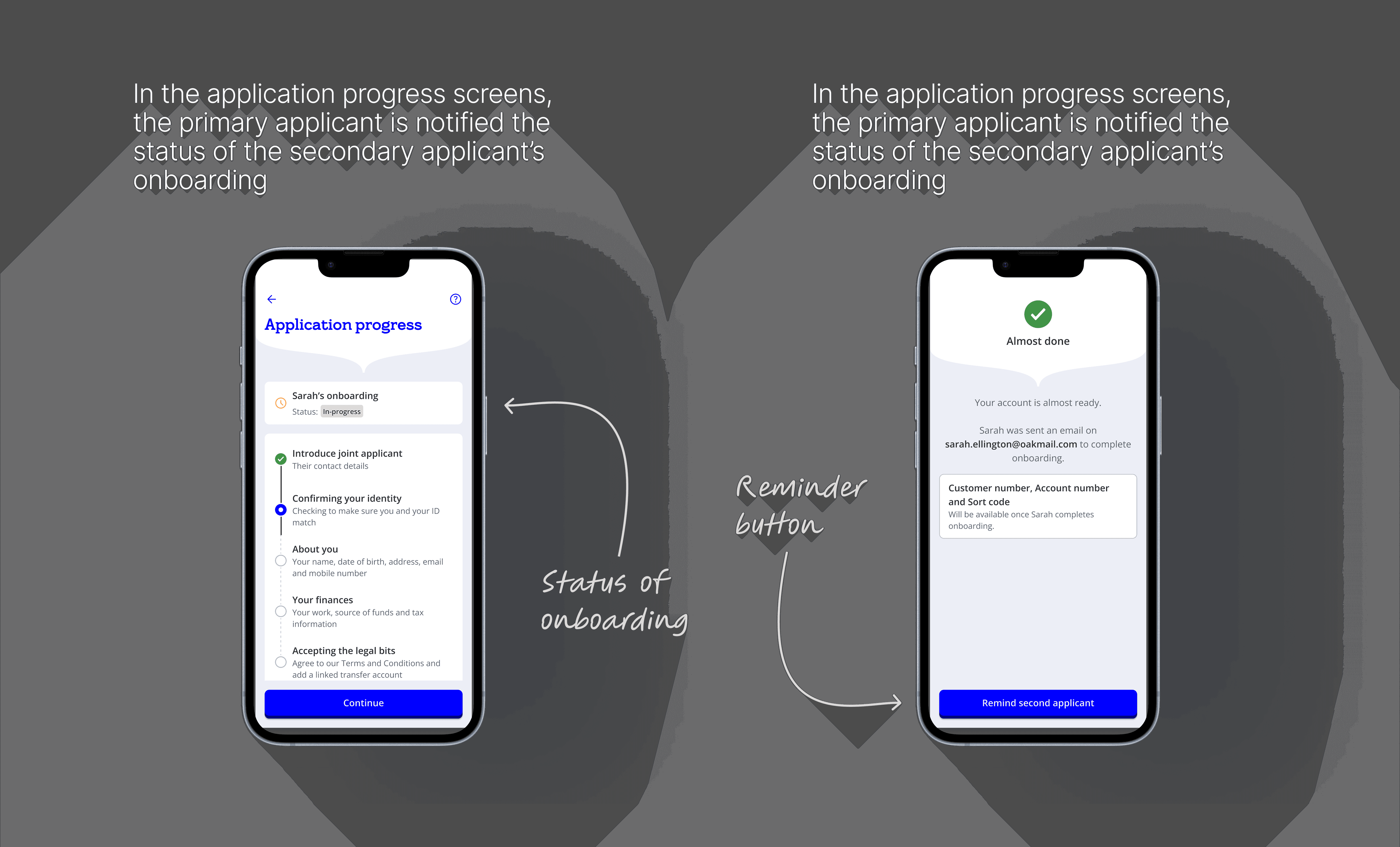
The experience acknowledged the reality of the process rather than pretending both applicants were moving through it simultaneously.
The experience acknowledged the reality of the process rather than pretending both applicants were moving through it simultaneously.
30 days shouldn’t disappear after one screen
30 days shouldn’t disappear after one screen
30 days shouldn’t disappear after one screen
Another requirement said customers needed to know they had 30 days to fund their new account. The information existed at the end of onboarding. But once the customer reached Home? Gone. I asked a simple question: “What happens if they forget?”
So I brought the information into the Home experience. We explored:
Plain copy → countdown → exact deadline
The final solution was deliberately simple with clear information: Last date: 27 July 2026
Another requirement said customers needed to know they had 30 days to fund their new account. The information existed at the end of onboarding. But once the customer reached Home? Gone. I asked a simple question: “What happens if they forget?”
So I brought the information into the Home experience. We explored:
Plain copy → countdown → exact deadline
The final solution was deliberately simple with clear information: Last date: 27 July 2026

The user didn’t need another reminder buried in onboarding. They could see the deadline where they actually manage their account. That’s UX beyond the brief: taking a requirement from “tell the user” to “make sure the user can act on it.”
The user didn’t need another reminder buried in onboarding. They could see the deadline where they actually manage their account. That’s UX beyond the brief: taking a requirement from “tell the user” to “make sure the user can act on it.”
Building a product that could grow
Building a product that could grow
Building a product that could grow
When we started, the bank wasn’t sure how many savings products would launch. So I didn’t design around a fixed number. I created a base product template that could accommodate product-specific information and functionality.
Then the number became: 12 products.
When we started, the bank wasn’t sure how many savings products would launch. So I didn’t design around a fixed number. I created a base product template that could accommodate product-specific information and functionality.
Then the number became: 12 products.

The same thinking carried into Account Management. Different products had different rules — maturity instructions, early closure, limited or unlimited withdrawals — so the experience needed to adapt without becoming 12 completely different interfaces.
The result was a product structure that could grow without starting from scratch every time the business changed its mind.
The same thinking carried into Account Management. Different products had different rules — maturity instructions, early closure, limited or unlimited withdrawals — so the experience needed to adapt without becoming 12 completely different interfaces.
The result was a product structure that could grow without starting from scratch every time the business changed its mind.
When technology says “not quite”
When technology says “not quite”
When technology says “not quite”
The design process was deliberately iterative:
Flow → Wireframe → Review → Refine → High fidelity → Tech → Compliance → Accessibility → Product
And sometimes the answer was simply: “We can’t build it that way.”
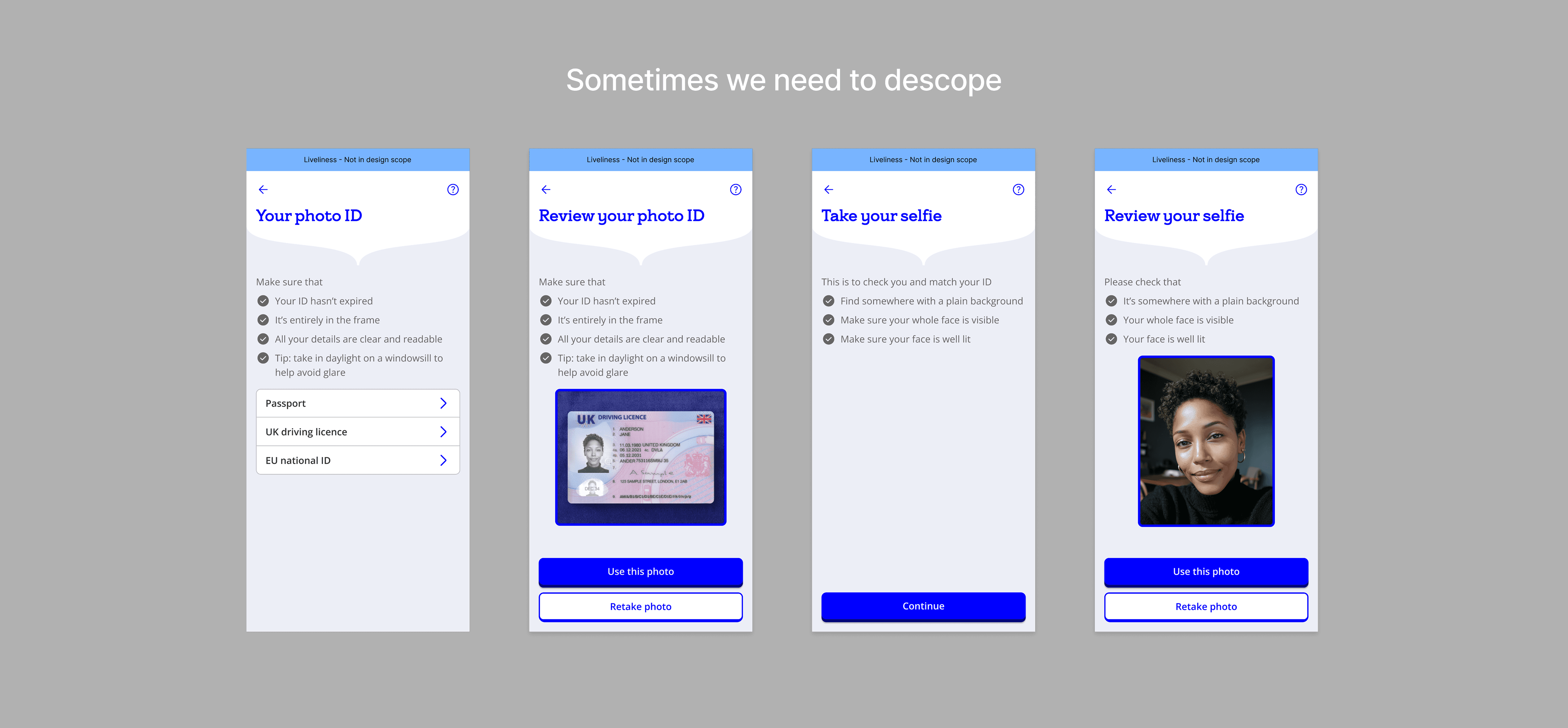
The liveliness check was one such example. We designed screens in accordance to our onboarding visual language, but there was a challenge in implementation because the check was happening in a thirsd party app - which means the screens weren't in our control. Unfortunately, we had to descope that part, where we had spend quite sometime on.
The design process was deliberately iterative:
Flow → Wireframe → Review → Refine → High fidelity → Tech → Compliance → Accessibility → Product
And sometimes the answer was simply: “We can’t build it that way.”
The liveliness check was one such example. We designed screens in accordance to our onboarding visual language, but there was a challenge in implementation because the check was happening in a thirsd party app - which means the screens weren't in our control. Unfortunately, we had to descope that part, where we had spend quite sometime on.

Designing for inactivity
Designing for inactivity
Designing for inactivity
Soon I realised how important it was to inform the user on the drop offs and that they will have to return back to finish there task especially onboarding.
Soon I realised how important it was to inform the user on the drop offs and that they will have to return back to finish there task especially onboarding.

Designing with compliance
Designing with compliance
Designing with compliance
Compliance brought another layer of complexity — particularly around tax and legal copy.
We also collaborated directly with Compliance in Figma, triaged their feedback using Claude and iterated the copy before testing it with a group of 10 users.
We also collaborated directly with Compliance in Figma, triaged their feedback and iterated the copy before testing it with a group of 10 users.
The result: User understanding improved by 15%.
More users were able to navigate the onboarding smoothly. The copy had stopped sounding like something written for compliance and started working for the customer.
We also collaborated directly with Compliance in Figma, triaged their feedback and iterated the copy before testing it with a group of 10 users.
The result: User understanding improved by 15%.
More users were able to navigate the onboarding smoothly. The copy had stopped sounding like something written for compliance and started working for the customer.

The result: User understanding improved by 15%.
More users were able to navigate the onboarding smoothly. The copy had stopped sounding like something written for compliance and started working for the customer.
We also collaborated directly with Compliance in Figma, triaged their feedback and iterated the copy before testing it with a group of 10 users.
The result: User understanding improved by 15%.
More users were able to navigate the onboarding smoothly. The copy had stopped sounding like something written for compliance and started working for the customer.
We also collaborated directly with Compliance in Figma, triaged their feedback and iterated the copy before testing it with a group of 10 users.
The result: User understanding improved by 15%.
More users were able to navigate the onboarding smoothly. The copy had stopped sounding like something written for compliance and started working for the customer.
A few things I didn't want to miss
A few things I didn't want to miss
A few things I didn't want to miss
• Accessibility
Small details mattered. We refined terminology and changed the Home account cards to include explicit titles — making the content clearer and more accessible rather than relying on visual styling alone.
• Accessibility
Small details mattered. We refined terminology and changed the Home account cards to include explicit titles — making the content clearer and more accessible rather than relying on visual styling alone.

• Multiple accounts
One customer might have a Personal, Joint, Minor and POA account. So Home needed to answer a simple question: “Which account am I looking at?” I designed a profile switcher so customers could move between accounts without losing context.
• Multiple accounts
One customer might have a Personal, Joint, Minor and POA account. So Home needed to answer a simple question: “Which account am I looking at?” I designed a profile switcher so customers could move between accounts without losing context.

• And sometimes, the right UX decision is to wait.
Onboarding for Businesses moved from Release A to Release B while the bank figured out its product variants. Since the underlying experience had already been templatised, this wasn’t a restart. The foundation was ready. We just needed the right information to plug in.
• And sometimes, the right UX decision is to wait.
Onboarding for Businesses moved from Release A to Release B while the bank figured out its product variants. Since the underlying experience had already been templatised, this wasn’t a restart. The foundation was ready. We just needed the right information to plug in.
What happens next?
What happens next?
What happens next?
The product is now in build.
The next step is user testing across the wider experience — including My Profile, Move Money, Account Management and the other journeys designed alongside onboarding.
The goal isn’t to ask: “Do you like the screens?” It’s to find out whether the decisions behind them actually hold up when real people use the product.
The product is now in build.
The next step is user testing across the wider experience — including My Profile, Move Money, Account Management and the other journeys designed alongside onboarding.
The goal isn’t to ask: “Do you like the screens?” It’s to find out whether the decisions behind them actually hold up when real people use the product.

Got something exciting to build?
Your next project needs a multi-eyed, multi-disciplinary designer, who can turn complex systems into simple flows.
Got something exciting to build?
Your next project needs a multi-eyed, multi-disciplinary designer, who can turn complex systems into simple flows.
Got something exciting
to build?
Your next project needs a multi-eyed, multi-disciplinary designer, who can turn complex systems into simple flows.