
Fintech
Fintech
Money Buckets
Money Buckets


A feature redesigned in a legacy mortgage app, from confusing to believable, spanning savings, borrowing and loan buckets in a single mental model
A feature redesigned in a legacy mortgage app, from confusing to believable, spanning savings, borrowing and loan buckets in a single mental model
A feature redesigned in a legacy mortgage app, from confusing to believable, spanning savings, borrowing and loan buckets in a single mental model
My role:
My role:
My role:
Design lead &
dev support
Design lead & development support
Design lead &
dev support
Design lead and development support
My engagement:
My engagement:
4
months
4 months
My engagement:
6
months
Build type:
1 → 10 add feature, mobile
Client:
A leading mortgage bank in UK
Build type:
Build type:
1 → 10 add feature,
mobile
Client:
Client:
A leading mortgage bank in UK


What was broken? What people really needed?
What was broken? What people really needed?
What was broken? What people really needed?
We talked to real mortgage users—seasoned savers, anxious borrowers, first-time goal-setters. And the theme was loud and clear:
“I made a bucket, but nothing changed on my screen. Did it work?”
“It’s not clear what I’m supposed to do.”
Users couldn’t trust their money math. There were no clear updates and the interface left too much to guesswork.
We talked to real mortgage users—seasoned savers, anxious borrowers, first-time goal-setters. And the theme was loud and clear:
“I made a bucket, but nothing changed on my screen. Did it work?”
“It’s not clear what I’m supposed to do.”
Users couldn’t trust their money math. There were no clear updates and the interface left too much to guesswork.
We talked to real mortgage users—seasoned savers, anxious borrowers, first-time goal-setters. And the theme was loud and clear:
“I made a bucket, but nothing changed on my screen. Did it work?”
“It’s not clear what I’m supposed to do.”
Users couldn’t trust their money math. There were no clear updates and the interface left too much to guesswork.
The glow up
The glow up
The glow up
Confusing UI to clean visual layout
No feedback to confirmations and animations
Cold tone to friendly and helpful guidance
Generic setup to personalised, goal-based buckets
Confusing UI to clean visual layout
No feedback to confirmations and animations
Cold tone to friendly and helpful guidance
Generic setup to personalised, goal-based buckets
Confusing UI to clean visual layout
No feedback to confirmations and animations
Cold tone to friendly and helpful guidance
Generic setup to personalised, goal-based buckets
From scribbles to something solid
From scribbles to something solid
From scribbles to something solid
We prototyped fast, tested often and stayed close to users throughout.
A major red flag?
Users didn't trust balance changes. So we built:
• Pending states for transparency
• "You did it" messages for instant feedback
• Gentle nudges to keep users moving forward
We prototyped fast, tested often and stayed close to users throughout.
A major red flag?
Users didn't trust balance changes. So we built:
• Pending states for transparency
• "You did it" messages for instant feedback
• Gentle nudges to keep users moving forward
We prototyped fast, tested often and stayed close to users throughout.
A major red flag?
Users didn't trust balance changes. So we built:
• Pending states for transparency
• "You did it" messages for instant feedback
• Gentle nudges to keep users moving forward
We prototyped fast, tested often and stayed close to users throughout.
A major red flag?
Users didn't trust balance changes. So we built:
• Pending states for transparency
• "You did it" messages for instant feedback
• Gentle nudges to keep users moving forward
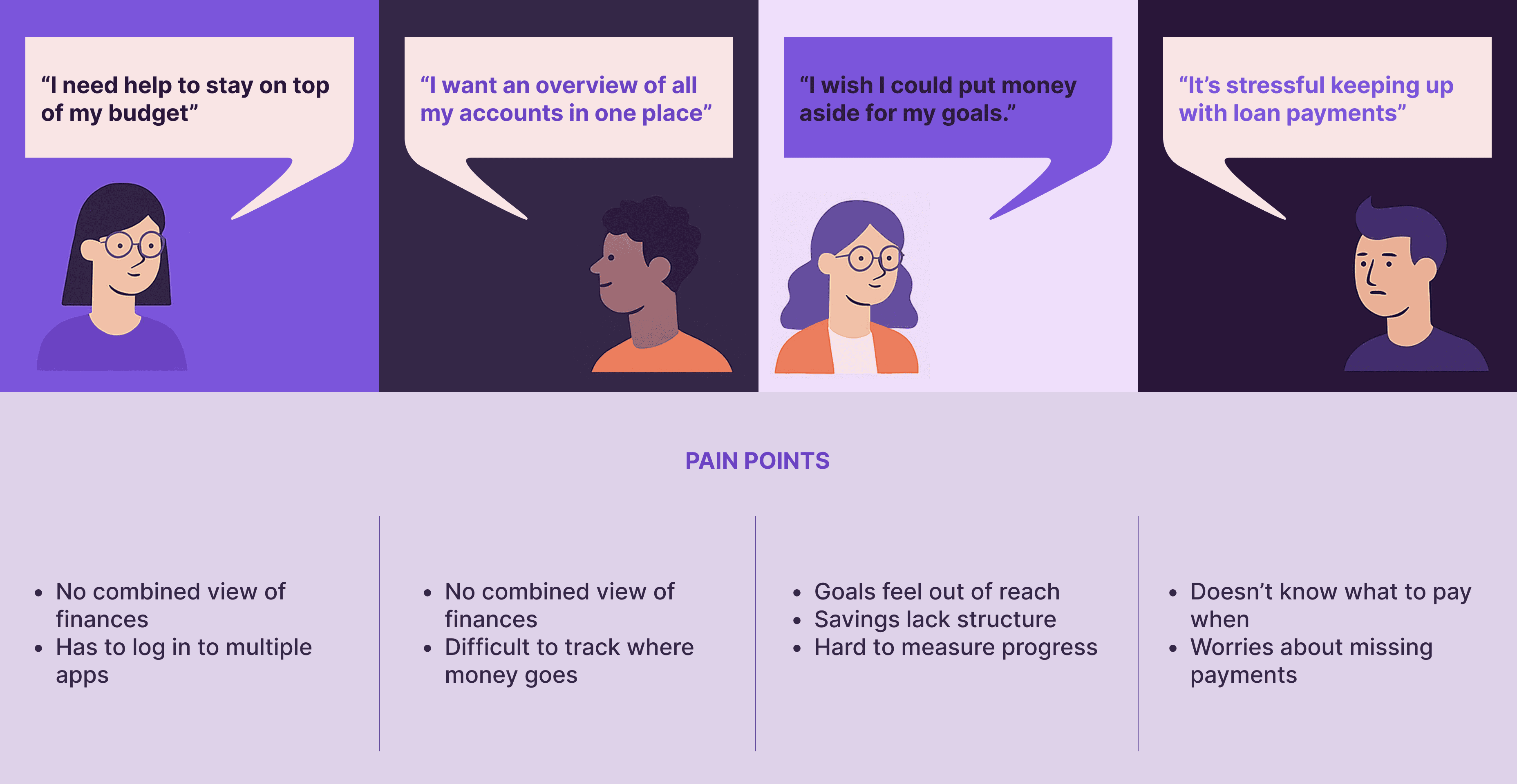
Our users were really frustrated!
Our users were really frustrated!

It started with a bucket
It started with a bucket
Well, not a real bucket. A Money Bucket, a virtual space where users could sort their finances, set goals and feel a little more in control.
Except… they didn’t. Because the money math just wasn’t mathing.
Users weren’t sure what was happening when they moved money. There were no confirmations. No visual progress. No feeling of “Ah, yes I’m on track.”
So we fixed it.
My first instinct was to collect basic details — email and phone — before asking what kind of account the customer wanted. The business wanted the opposite. They needed compliance checks to happen before customers invested time in the application. So the “Before you begin” screen moved to the front.
A small change in sequence. A big change in what the journey was optimising for.
From scribbles to something solid
The role I played
The role I played
Spoiler: It was a big one.
As a senior UX designer, I wore all the hats (except maybe the developer one - thankfully we had help there)
I led:
• The design strategy and UX direction
• Research analysis, stakeholder workshops and team rituals
• Wireframes, prototypes and final polished UI
• Endless teams threads titled "Quick Q" theat were never that quick
My goal: make this feature so clear and helpful that users wouldn't need a manual (or a support call).
My first instinct was to collect basic details — email and phone — before asking what kind of account the customer wanted. The business wanted the opposite. They needed compliance checks to happen before customers invested time in the application. So the “Before you begin” screen moved to the front.
A small change in sequence. A big change in what the journey was optimising for.
From scribbles to something solid
Every great quest needs a crew
Every great quest needs a crew
"If you want to go far, go together." - African proverb
My partners in the quest:
• A sharp UX Researcher who asked all the right questions
• A small but mighty Dev team who brought everything to life
• And a rotating cast of stakeholders with ever-shifting priorities (and strong opinions)
We also studied Google Pay, Splitwise, and other tools. They looked good—but lacked the deep integration we could offer inside the mortgage ecosystem. That was our edge.
"If you want to go far, go together." - African proverb
My partners in the quest:
• A sharp UX Researcher who asked all the right questions
• A small but mighty Dev team who brought everything to life
• And a rotating cast of stakeholders with ever-shifting priorities (and strong opinions)
We also studied Google Pay, Splitwise, and other tools. They looked good—but lacked the deep integration we could offer inside the mortgage ecosystem. That was our edge.
My first instinct was to collect basic details — email and phone — before asking what kind of account the customer wanted. The business wanted the opposite. They needed compliance checks to happen before customers invested time in the application. So the “Before you begin” screen moved to the front.
A small change in sequence. A big change in what the journey was optimising for.
From scribbles to something solid
The bucket list
The bucket list
We wanted to turn confusing money math into something visual, helpful, and human.
So we designed for:
• Guided setup — clear, step-by-step
• Visual progress — see how close you are to your goals
• Real-time feedback — no more “Did that go through?”
• A single dashboard — savings and borrowing in one view
My first instinct was to collect basic details — email and phone — before asking what kind of account the customer wanted. The business wanted the opposite. They needed compliance checks to happen before customers invested time in the application. So the “Before you begin” screen moved to the front.
A small change in sequence. A big change in what the journey was optimising for.
From scribbles to something solid

We tested this Quick Prototype with 10 users
We tested this Quick Prototype with 10 users

We worked our magic in the tough parts of the road.
We worked our magic in the tough parts of the road.
Did it work? Heck yes.
Did it work? Heck yes.
Steve Jobs once said,
“Design is not just what it looks like… it’s how it works.”
Turns out, when you fix the money math, people start using the tool.
Here’s what changed:
+35% increase in daily active users
60% of users said they felt more in control
4.7/5 average satisfaction score post-launch
Steve Jobs once said,
“Design is not just what it looks like… it’s how it works.”
Turns out, when you fix the money math, people start using the tool.
Here’s what changed:
+35% increase in daily active users
60% of users said they felt more in control
4.7/5 average satisfaction score post-launch
What I took away?
What I took away?
(Besides 57 Versions of the Same Flow)
• In money tools, confidence > features
• Clarity builds trust, especially around numbers
• Tiny UX details (tooltips, states, confirmations) = huge emotional wins
Also: Good cross-team collaboration is just as powerful as any design system.
(Besides 57 Versions of the Same Flow)
• In money tools, confidence > features
• Clarity builds trust, especially around numbers
• Tiny UX details (tooltips, states, confirmations) = huge emotional wins
Also: Good cross-team collaboration is just as powerful as any design system.
The sequel
The sequel
The sequel
Money Buckets was just the start. Here’s what I’d love to see next:
• Smart reminders when users fall behind
• Small celebrations when they hit goals
• Deeper integration with the rest of the mortgage journey
Money Buckets was just the start. Here’s what I’d love to see next:
• Smart reminders when users fall behind
• Small celebrations when they hit goals
• Deeper integration with the rest of the mortgage journey

Are you a person who keeps those initial sketches?
Are you a person who keeps those initial sketches?

The old guy looked something like this.
The old guy looked something like this.

From ‘Confusing UI’ & ‘No Feedback’ to this, we came a long-long way.
From ‘Confusing UI’ & ‘No Feedback’ to this, we came a long-long way.

Things were personal now.
Things were personal now.

Well, no design is final but this was our Finalest-Final screens in Figma.
Well, no design is final but this was our Finalest-Final screens in Figma.
Got something exciting to build?
Your next project needs a multi-eyed, multi-disciplinary designer, who can turn complex systems into simple flows.
Got something exciting to build?
Your next project needs a multi-eyed, multi-disciplinary designer, who can turn complex systems into simple flows.
Got something exciting
to build?
Your next project needs a multi-eyed, multi-disciplinary designer, who can turn complex systems into simple flows.